Sunday, December 27, 2009

Random Nancy Panel


Calling Dr. Freud!

Fashion Victim: Vintage Ties


Click for bigger

I don't have to wear a tie to work; I choose to. Ties are, like, the accessory fairy's gift to man. If you just buy "acceptable" ties at Macy's or, worse, TJ Maxx, then you really aren't trying. Skimping on shirts? That's fine. Skimping on ties? Unacceptable.

The ties I wear tend to be in two categories: cheap vintage ones (so plentiful on eBay*!) and expensive new Italian ones (Pucci, Missoni and Fendi are favorites). Fashionable tie width is something I let other people worry about; the ones I sport range from the narrowest ribbons to gigantic 5-inchers from the 70s.

Shown above from left to right:
  • Very narrow green and black striped silk with embroidered chess motif, maker unknown. I don't know when ties this skinny were in fashion. Late 1950s? Dating ties is difficult.
  • Black and gray striped narrow tie with red abstract motif, probably early 1960s, probably rayon or acetate, no label.
  • Black and white diagonal stripe, rayon, maker and era unknown. Flat bottom!
  • Orange/brown mottled design with heraldic motif, probably early 1960s, probably silk, no label.

Wear a beautiful tie tomorrow, OK?

*Honestly, eBay is a bottomless pit filled with wondrous vintage ties. Some sellers offer lots of several, and even if only 1/3 of the batch are good, it's still worth it. The two ties on the right of the picture above came from a lot of ten I purchased for $30, and all ten were fabulous. That's ten great ties for the price of one horrible Geoffrey Beene piece of junk from a department store!

Saturday, December 26, 2009

Press Kit For Tim Burton's Ed Wood, 1994


Click for bigger, furrier.

When I was art editor/staff writer for Hypno magazine in San Diego, I got a lot of interesting mail: press releases, freebies, belts, leather chaps (!), CDs, books, you name it. This was one of the most delightful and creative, press materials for Ed Wood sent in a pink, faux fur mailing envelope. I love the idea of this thing brightening the day of hundreds of mail carriers. Here's a picture of the front cover of the folder inside (all below can be clicked for larger versions):


I did enjoy Burton's movie, although in my review I said that in concentrating on Wood's giddy enthusiasm, missing was any indication of the sting of failure the hapless director must have felt; he simply couldn't have been so cheerful all the time; he must have had several dark nights of the soul, as it were. Since then, I've come to like the movie a lot more, impressed more by what it is than what it isn't. Frankly, I think Tim Burton is a tremendously overrated director. I feel like he's always holding back his weirder and darker visions, sacrificing them to achieve a commercial product.  Think of how great Charlie and the Chocolate Factory could have been if it had less Disney, more Dahl! What a missed opportunity. A great example of this can be found in the extras on the Ed Wood DVD, a scene where Bill Murry sings a song while moving through a meat locker of hanging carcasses. The scene is bizarre and wonderful, and ended up on the cutting room floor, a superb casualty to cooler heads prevailing. Tsk.

Below are some of the stills from the press kit:


As for Ed Wood's own movies, I endorse them wholeheartedly. Like many who came of age in the 70s and 80s, I used to subscribe to the idea that I liked things that were "so bad they're good." Over the years, though, I've come to object to that idea, and I've tried to train myself out of this thought process. I don't like Ed Wood's films because they're bad; I like them because I think they're great! They're engaging, entertaining, surprising, weird, original, fascinating, hilarious... these aren't "bad" things, these are good things! The "so bad it's good" mindset comes from a standpoint of condescension, a feeling of embarrassment for enjoying something which doesn't live up to conventional standards of "quality." But you know what? I couldn't make a better movie than Plan 9 from Outer Space. Could you?

Thursday, December 24, 2009

Book Shelf: Ridiculous Vintage Philip K. Dick Paperback Covers


Click all for bigger

Poor Phil! These are original mid-1960s Ace paperback editions of his now-acclaimed novels. Any of you who have read these will recognize that the lurid cover illustrations have nothing –nothing whatsoever– to do with the contents within. Artwork like this is often known to collectors as the "peeled eyeball" style. Ace knew the stuff was good, but they also had no trust in the general public and also knew they had to appeal to 14-year-old boys who really just wanted to read about zap guns, robots and bug-eyed monsters. Solar Lottery was originally serialized in 1955 and had to wait ten years for a "first edition" book release! These are trashed; if I wanted to read these novels again (and I will), I'd buy the tasteful reprints currently available in most bookshops, because if I were to open any of the ones shown here, they'd probably explode in a cloud of splinters, sawdust, and silverfish parts. Here are two more:


Wednesday, December 23, 2009

Tuesday, December 22, 2009

Photo Album: Geneva, 1983


Two posts in a row featuring McDonald's!

I accompanied my father on a business trip to Geneva, Paris, and London in 1983, just after graduating from high school. Geneva is really a boring but beautiful city; it's Europe's San Diego, really. The above kiosk advertisement amused me greatly. If anything, it shows how my obsession with corporate marketing is nothing new.

The collage below (click for bigger) is more interesting: posters and graffiti I shot in search of Swiss subculture:


Sonic Youth were nobodies outside New York at this point; this must have been their first European tour. Note also the Bauhaus stencil and humorous "corrected" punk tag. Alors!

Also: remember those awful sticky-pages photo albums? 

Fashion Victim: Promotional Belt Buckles


Wait, what? A Dennison's Chili belt buckle? Huh?

You have to understand 1970s marketing. Belt buckles were a common promotional item back then, like t-shirts and trucker hats. I assume that the original owner of the top one shown here obtained it by sending in a form from the Sunday coupon section along with a few proofs of purchase. I've got several of these things, enough to know that they were hardly rare.

This is the kind of thing that makes my coworkers shake their heads and give up trying to figure me out (mission accomplished!). Heck, even I can't figure out what kind of person wears a Dennison's Chili belt buckle.

You have to admit, though, that the copyright symbols lend them a touch of grandeur, no?

Monday, December 21, 2009

Grandma

Click for bigger.

Earlier this month I showed you a photograph of my grandfather, Richard Douglas Huestis. Shown above is a painting of his wife, my grandmother, Marie Marguerite Hinde Huestis (1899-1950).

It makes me sad that I never met her. She was absolutely obsessed with art and style (sound familar?). She loved to paint (I've never seen any of her paintings) and made beautiful woodcuts. My parents still have a gorgeous dining table and sideboard she designed in Art Deco style.

Marie Huestis also simply adored artists, and hosted them whenever she could. She was especially fond of Canada's famous (for Canada) Group of Seven painters, and socialized with them often. An avowed modernist, she liked to think of herself, I believe, as Montreal's Gertrude Stein. She made sure her children received extensive arts educations; her daughter (my Aunt Joan), went on to be a professional painter and portraitist, and my father grew up to be an inspired amateur. My grandfather thought all this nonsense was a waste of time, but indulged his beloved. It goes without saying that I owe this wonderful woman a lot, even though I never met her.

The portrait above was painted by Edwin Holgate, one of Canada's most accomplished artists, in 1930, and I believe it is one of his masterpieces, although it has not been published.  You can see a lot more of his artwork here. His debt to Cézanne is obvious. I wish we had known ahead of time about the Montreal Museum of Fine Art's Holgate retrospective in 2006. Grandma would have been thrilled to participate.

Saturday, December 19, 2009

Things I Love: Vagina Dentata Imagery


No, no, I don't own these. These come via eBay. Psychologically complex!

Friday, December 18, 2009

Things I Love: Vintage Stewardess Uniforms


This is ancient history, and I'm sure this has been all around the internet ten gazillion times, but have you seen this site about this nutty Dutch guy's obsession with stewardess uniforms? "Welcome to my world of stewardess uniforms," he cries, and I respond with an enthusiastic "Yes, please, let me in!"


So if you're like me, and you like to stare for hours on end at hundreds and hundreds of pictures of vintage stewardess uniforms from the entire history of stewardesses, all displayed on the same mannequin shot from the same angle, while you are supposed to be working, then this site is for you. 


I'm warning you, though, that this site is a real rabbit hole.


Also! You'll be touched by his story that he dreamed of being a stewardess all his life, and his dream came true! One thing, though: look at the page with pictures of the collector, and I think you'll agree  that the site would be about a gazillion times better if he photographed himself in all the stewardess uniforms. 

UPDATE: OMG, font troubles! Whichever font should I use?

Painting: Georgia On My Mind


Georgia II, 2001, acrylic on hardboard, 16x20. Click for bigger!

I generally dislike Georgia O'Keeffe, and not just for professional reasons (she instituted a policy at my workplace which is the bane of my existence). What's hilarious about her –actually, the only hilarious thing about her– is the way she used to deny that her flower paintings were vaginal. The suggestion upset her!

So I decided to make a painting that was absolutely ridiculously genital, and achieved this goal by using the Nestlé and Lawry's logos.

This is the second version. The first was a reverse painting on plexiglas and quite a bit wider (with the Lawry's Ls farther apart).

Flyer For Art Show, 1995


I should point out that the Nancy panel used here is unaltered.

Book Shelf: Cry Me A River. Several Rivers


When I attended UC San Diego in the 1980s, my friends and I would gather at our buddy's Dan's house, across the street from the school, to watch Jim and Tammy Bakker on TV. This was, obviously, before their spectacular scandal hit. But OMG, did we ever love them! Jim and Tammy were pure, throbbing entertainment: blatantly bizarre, filled with histrionics, so unintentionally funny that segments could have been run on Saturday Night Live and been the funniest things on the show. My favorite show was "Tammy's House Party," in which Tammy would sit around her "living room" with guests and then, eventually, move to the kitchen to make some godawful trashy food. Generally you wouldn't have to wait more than 5-10 minutes for Tammy to cry, her greatest talent.

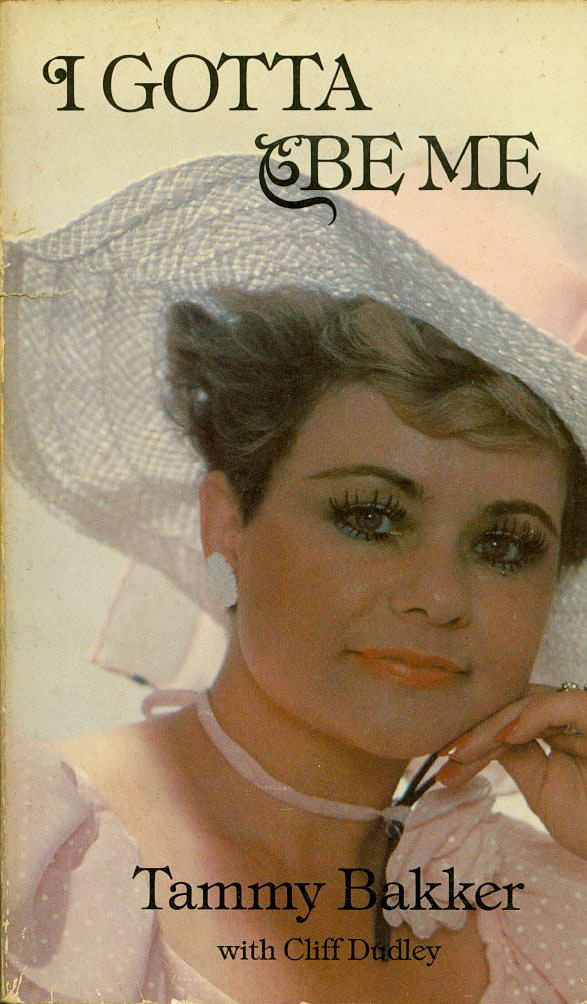
Jim and Tammy merchandise wasn't easy to come by; they weren't nearly the stars they would become later. I did find Tammy's biography, though, shown here, in a thrift shop. You can click it to see a bigger version. And it's so good! In it, Tammy talks a lot about her addiction to makeup, about how she has such low self-esteem that she would just bury her face in cosmetics. The other thing she talks about a lot is about how she cries all the time, like a never-ending saline fountain for Jesus.

I remember the guy shown on the back cover (see below), Tammy's ghost writer Cliff Dudley, was on the show a lot. Click on the picture of the back cover, please, and just admire that plaid suit! He always wore incredible suits with sensational ties. They also frequently hosted Gavin MacLeod and his Christian wife, Patti. At that point, MacLeod's Love Boat days were behind him, and nobody was hiring him, so he became a professional Christian.

Another fun part of the show was child exploitation! Jim 'n' Tammy would trot out their kids, Tammy Sue and Jay, at every opportunity. They always looked like they wanted to be somewhere –anywhere– else. I'm kind of amazed that Jay went on to become a preacher himself, as chronicled in the very, very entertaining, and even uplifting One Punk Under God reality show. He's now covered with tattoos and facial hair!

And, finally, there was singing, lots and lots of singing by Tammy. You can hear some examples here, as well as examples of their recordings for children.

I miss Tammy. She turned out to be OK, after all. If you haven't seen The Eyes of Tammy Fae, it's essential viewing. Watch delusional but kind-hearted Tammy pitch her "Tammy's Terrific Teens" television show to startled yet uninterested programming executives! See Tammy tell her makeup artists about her tattooed eyebrows! Marvel at Tammy's brave wardrobe choices!

Later, in 1987, when Jim and Tammy's PTL scandal hit, my friends and I were initially overjoyed: our favorite performers had become superstars! Quickly, however, we realized that this was NOT a good thing, because all their wonderful, wonderful shows disappeared from the airwaves. No more Tammy's House Party! *SOB*

Finally, here's the back cover:


Thursday, December 17, 2009

Document Of Considerable Historic Interest Rediscovered


Click for bigger, but please use cotton gloves.

See, now this, this is why I started this blog, so I would re-find things I haven't seen in a long time. Above is a scan of an original Yellow Pages ad for the Knoxage Water Company in San Diego, the one I used ten years ago to steal the design accurately. Those of you who have seen my stuff on the web for a while will immediately grasp the significance of the clipping.

For the rest of you, I'll get you up to speed: I am totally obsessed with "Knoxie," the brave corporate deer. In 1999, for instance, I came up with a Knoxie gag cartoon a day for twenty days. I painted paintings of Knoxie. I drew Knoxie in my sketchbook. My coworker and I acted out little dramas between Knoxie and Trotski, his evil twin:


You can tell it's the evil one because he only has three legs. This is very important!

Later, on the interwebs, I used Knoxie more or less constantly during a period when I participated in the Photoshop contests at Fark. like this dumb one:


Is it possible to fall in love with a corporate logo? I say YES. Won't you accept Knoxie into your life?
Something tells me you're going to be seeing a lot of Knoxie on this page. Praise him!

Random Nancy Panel


Book Shelf: Supermag!


Remember ordering books and magazines from the Scholastic Book Club? This a small, digest-sized magazine from 1977, so I was twelve when I ordered it. Anything good inside? Oh, my, yes. First, a moving look at the world of customized vans (the images below can be clicked for bigger/readable):


And a profile of OJ Simpson featuring a hunky glamor shot of OJ looking unconvincing as an African tribesman in Roots:


Wednesday, December 16, 2009

Object Perceived As Useless Becomes Unexpectedly Helpful


Sketchbook: Boring Meeting Doodle


Abba Merchandise Order Form


I believe this sheet came with the Voulez Vous album in 1979. The hats are incredible, but the "bridal satin" tour jacket looks like Paul Smith's bad dream. You can click both of these for bigger!


Tuesday, December 15, 2009

The Greatest Sign In The History Of Ever


Click for huge! I'm totally making this my new desktop image at work. Related post.

Random Nancy Panel


Ernie Bushmiller's Nancy had a shaky start: she was originally introduced as a Cousin Oliver-like latecomer in the Fritzi Ritz strip in the 1930s. At first she was more or less just simply somebody for Fritzi to talk out loud to. Those more familiar with the later "classic" Nancy and Sluggo gag comics may be surprised to hear that Fritzi Ritz was a serial strip, a continuing story, so that Nancy at first was part of an ongoing comic soap opera. When Bushmiller later eschewed continuity for a stand-alone "gag a day" format, his drawings seemingly crystallized in response, becoming almost inhumanly perfect in every way. All the formerly fussy backgrounds became starkly diagrammatic, and the whole strip became something like a series of Mondrians with punchlines. Nancy and Sluggo is the immaculate lawn of American modernism, almost semaphoric, like Atomic Age hieroglyphics with bows and slot noses. It's hard to see how Charles Schulz could have arrived at Peanuts' radical minimalism without Bushmiller's example.

Look again at the panel up top. It is just perfect. That's as well a filled rectangle as any other artist made during the entire 20th century.

Inside The He-Man Lunch Box


Click for bigger

  1. Mostly used tube of Clubman mustache wax and comb. This is from about 1994 when, yes, I sported an affected mustache. You'll be seeing drawings by famous cartoonists of that mustache here, eventually. How embarrassing. Ew, I think I can throw these out now.
  2. Quote I jotted down from a friend about his philosophy of art appreciation.
  3. Reaganbusters button. Political!
  4. Crazed looking Bugs Bunny Pez™ dispenser.
  5. Dan Clowes/Peter Bagge tour button.
  6. My father was made an honorary citizen of Uzbekistan in the 70s because he totally revolutionized their way of doing blood transfusion and is awesome. At the ceremony, they gave him beautiful silk robes and a dagger for each of his sons. Sorry, sisters, nothing for you! Anyway, this is my special dagger. Handy!
  7. Gruesome severed arm of ET.
  8. My friends and I went to Denny's (second mention on this blog!) once, and all the waitresses were wearing these great "Have Some Orange Juice!" buttons. We admired them and our server surprised us by giving us a bunch of them! Trust me when I say that on a Denny's waitress the button made sense, but on us they became peculiar Dada statements. Have some orange juice! Go ahead!
  9. Howard the Duck campaign button, 1976. You used to be able to watch Howard the Duck - the Movie at Hulu, but they seem to have taken it down. It's OK, though, because it really is a terrible movie: unfunny, not enjoyable in an ironic way; it really is just hopeless. But have you ever seen the original comic books? They are absolutely great in every way, satirical and hilarious. Recommended!
  10. Garbage Pail Kids badge. Oh, god, my friend Nicky and I loved GPKs and collected them obsessively. And we were in our twenties! Later, I became friends with their inventor, Mark Newgarden, who said that he always got a special lift when he'd see kids' dressers plastered with them in thrift stores.

Still Life: Bimbo and Wienermobile


Click for really quite a bit bigger.

Oh, hey, it's Betty Boop's pal Bimbo! All ready for a ride on the Wienermobile! Yay!

What's In The Lunch Box?


1983, Aladdin Industries, Nashville

Check back this evening to see.

Fashion Victim: Clammy, Marbled Shirt


Click for bigger.

The printing on this shirt is glorious: marbled tangerine and turquoise with touches of pink and red. Too bad the damn thing is almost totally unwearable.

I have several marbled shirts from the 60s/70s. These things were probably expensive new. Most of my marbled disco shirts, however, are polyester. This one, tragically, is made out of nylon... horrible, clammy nylon, so awful to wear that it makes the worst double-knits seem breezy by comparison. Tsk. I should probably cut it up to make pocket squares.

Painting: High Colonel-ic


Click for bigger.

Above is a picture I made in 1995. It's 18"x24" and is a reverse painting on glass. It's a difficult technique,  but the end result –so flat! So clean!– makes it worthwhile.

I haven't made one of these in a long time. I used to show them in San Diego and Los Angeles, doing mostly coffee shop shows in the former and being included in group shows in the latter. It was fun for a while, but I ended up being more comfortable "behind the scenes" in the art world.

Never say never, though; those greyhounds are a powerful pull!

Monday, December 14, 2009

Sketchbook: Name Game


02-16-2002

A-Team Puffy Stickers


Hey, why not click for bigger? 

I purchased these in San Diego at Pic-n-Save in the mid 1980s. My friends and I were obsessed with Pic-n-Sav, a chain of regional discount stores. We even made custom silk-screened t-shirts of their logo! Every single thing at Pic-n-Save was either a reject or a failure, making it a particularly bizarre shopping experience. Every flop trend, every irregular manufacturing error, every misspelled ceramic knickknack... they all ended up there. It was really trashy and really cheap. At the Arizona stores you could even get wine – the worst wine ever, ever made. God, that store was just so good.

Over-manufactured puffy stickers were a constant presence at Pic-n-Save; they had an actual puffy sticker section, but I guess that's the 80s for you. Trends on the wane  (like the A-Team, above, pretty long in the tooth by that time) were a common presence on such merchandise; if you were on a puffy sticker at Pic-n-Save, your career was in trouble.

I remember a friend of mine saying, "Can you imagine publishing a novel and then seeing it at Pic-n-Save a year later for 15¢? Wouldn't that be awful?" Yes, it sure would.

To make a long story short, holy cow did we ever buy some stupid shit at that store! You'll be seeing more of it here.

Art Collection: Tiny Walter Keane Reproduction


I have a lot to say about Walter Keane and Big-Eyed Art™, but not now. Happy Monday!

Sunday, December 13, 2009

Book Shelf: Decorate Your Life With Random Hunks Of Plastic


This slim craft guide was published in 1964 by Hazel Pearson Handicrafts, Rosemead, CA. I picked it up in the thrift store for its excellent cover graphics. You can click all of these for bigger, legible views. The page below shows you how you can use craft resin to glue hunks of shit to stuff, you know, for beauty:


This page encourages you to make lobsters and mandolins for your windows:


Reprint: Betty Crocker


Click for bigger, more pretentious.

I have only the vaguest memory of doing the above. Some people I sort-of knew in downtown San Diego made a freebie newsprint "nightlife guide" thingy called CLUE?  (with the question mark), because, duh, everybody wanted to make a magazine, a weekly, a nightlife guide, and you know, it's a good thing the internet came along and stopped this kind of nonsense.

Anyway! I think they offered me a page to do whatever I wanted because they liked my paintings. I guess I probably painted the image above in reverse on a sheet of acetate and then asked then to invert the colors, or maybe I painted it in white and put black paper behind the acetate. I don't have the original anymore, so I have no idea. It's sloppy, but I still like the sentiment!

I painted the Greyhound Bus logo for years, and if I ever start painting again, I'll probably paint almost nothing but Greyhound Bus logos.