Monday, December 14, 2009

Art Collection: Tiny Walter Keane Reproduction


I have a lot to say about Walter Keane and Big-Eyed Art™, but not now. Happy Monday!

Sunday, December 13, 2009

Book Shelf: Decorate Your Life With Random Hunks Of Plastic


This slim craft guide was published in 1964 by Hazel Pearson Handicrafts, Rosemead, CA. I picked it up in the thrift store for its excellent cover graphics. You can click all of these for bigger, legible views. The page below shows you how you can use craft resin to glue hunks of shit to stuff, you know, for beauty:


This page encourages you to make lobsters and mandolins for your windows:


Reprint: Betty Crocker


Click for bigger, more pretentious.

I have only the vaguest memory of doing the above. Some people I sort-of knew in downtown San Diego made a freebie newsprint "nightlife guide" thingy called CLUE?  (with the question mark), because, duh, everybody wanted to make a magazine, a weekly, a nightlife guide, and you know, it's a good thing the internet came along and stopped this kind of nonsense.

Anyway! I think they offered me a page to do whatever I wanted because they liked my paintings. I guess I probably painted the image above in reverse on a sheet of acetate and then asked then to invert the colors, or maybe I painted it in white and put black paper behind the acetate. I don't have the original anymore, so I have no idea. It's sloppy, but I still like the sentiment!

I painted the Greyhound Bus logo for years, and if I ever start painting again, I'll probably paint almost nothing but Greyhound Bus logos.

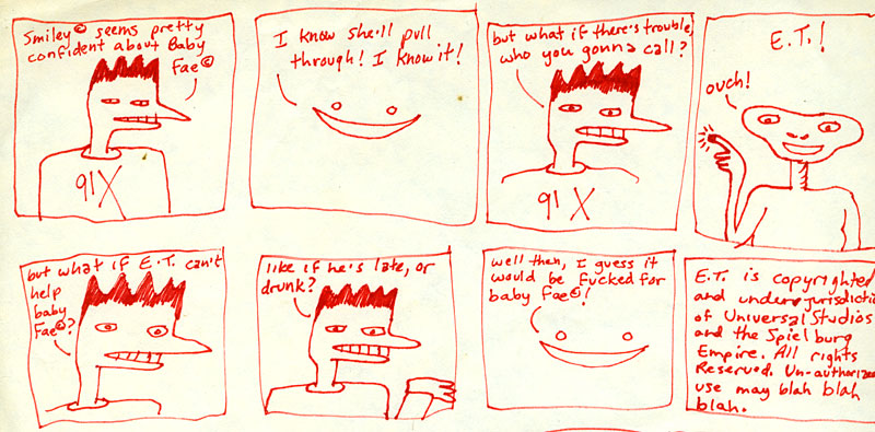
Comics: 80s Nostalgia


Click for bigger/legible

I've never considered myself a cartoonist: I'm too lazy and not obsessive enough. That never stopped me from drawing comic strips, though, when I was bored or stuck in a place with nothing better to do. I like the one above, drawn in 1985 when I was 19, because it features a tasteless reference to Baby Fae, one of the most unlikely media celebrities of the decade.

The 91X t-shirt is meant to be ironic; I hated that radio station.

Book Shelf: Weird Peanuts Merchandising


My family, like most in the late 1960s and early 1970s, was just bonkers for Charles Schulz' Peanuts. We had Peanuts merchandise everywhere: felt banners, dolls, Colorforms™, posters, etc. The English Bulldog we acquired in 1965, when I was an infant, was named Linus. I still love Peanuts, and I've been methodically buying Fantagraphics' magnificent reprinting of the strip's entire run.

One thing that's striking about rereading all the Peanuts strips is really what a downer it is. Schulz' act of alchemy was this: combining anxiety, frustration, depression and obsessive-compulsion with incredibly cute, funny drawings to make the medicine go down. And here's what often makes Peanuts merchandise so weird: all the anxiety, frustration and depression goes out the window. So in the strip, all the characters are neurotic and delusional, but on the greeting cards they're all happy, happy, happy!

Above is a little, thin, 3"x4" hardcover mini-book/greeting card by Hallmark which I gave to my brother in 1977 when he graduated from high school (I stole it back later). It's pretty lightweight stuff, natch. The characters are shown against a garish orange background, which is as anti-Schulz as the wonderful typestyle used for the cover.

But it's still, after all, Peanuts, so it's hard to keep out all the negativity. Here's my favorite page, rendered absolutely bizarre by its decontextualization:


So weird! Out of all the panels and drawings they had available to them, Hallmark chose that. Aren't you glad?

Saturday, December 12, 2009

Random Nancy Panel


Sketchbook: The Excitement Never Stops


(Houston, Texas, 2002)

Reprint: Interview With Cartoonist Chris Ware, 1995

In the mid 1990s, I wrote full-time for Hypno Magazine, a hipster periodical too ambitious to call a "zine" yet too inept and garish to to become a mainstream success. The bad thing about it was that the publishers were utterly cretinous and maddening, but the good thing was that I got tons of space to write about whatever I wanted. I love alternative comics, so I ended up interviewing all of my favorites, a rare treat. The following is a scan of my 1995 feature on Chris Ware. This may have been his first interview. At the time, Chris had only published four issues of his famous Acme Novelty Library, and he was still relatively unknown to mainstream audiences. In retrospect, I'm a little mortified by my "not-getting-it" questions (his stuff was new!), but impressed with and gratified by Ware's ability to return them with fascinating answers.

This interview is going to be reprinted next year in a volume called Chris Ware: Conversations, edited by Daniel Goldmark and published by the University Press of Mississippi, but I don't know if they are going to include my too long, windy introduction. The scans below are optimized for text legibility, and most of the artwork looks terrible. Click each for bigger:


Friday, December 11, 2009

Sketchbook: List Of Girls' Names From Old Arizona High School Yearbooks


Unloved Junk Painting Lives To Be Destroyed


I was wandering around my work today and came across, in one of the offices, one of our sad garbage paintings, seen above (click for a larger view). Why do we have such things? Well, when you think about it, if a conservator is going to experiment, you know, hot-dogging with solvents, she or he isn't going to test these things on a Rembrandt, right? Therefore we have a supply of these junky old things, bad old fourth generation copies of old master paintings, academic works by untalented students, etc. But they're usually really old, so when you encounter one, it can be alarming. Neat!

Random Nancy Panel


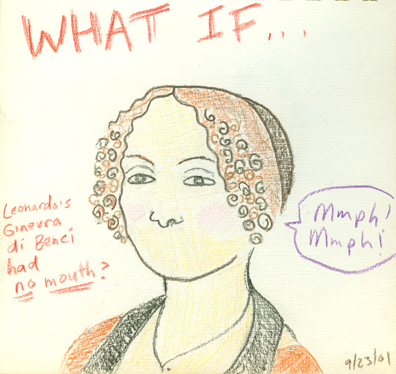
Sketchbook: The Da Vinci LOL


Click for bigger

Book Shelf: Instapublishing, 1981


This is basically the early-80s version of a Tumblr blog, right? It took three people to write this book! And believe me, it's not because the contents belie genius brainstorming between the authors; they just wanted to get the book printed and on the shelves as quickly as possible, to strike while the fad-iron was hot.

Trust me when I say it isn't worth excerpting.

I was in high school when the Rubik's Cube hit. I wasn't into it. My friends and I loved mocking trendy junk like this; we collected, for instance, terrible/weird ET merchandise. We were, after all, hardened and cynical kids, like most born in the mid 60s. I'm pretty sure I bought this for 10¢ at Pic 'n' Save.

Thursday, December 10, 2009

Welcome to the Junk Drawer

The easiest way to describe the difference between this blog and my defunct old one is that this one will be more about things I like rather than things that I dislike or things that bring me close to feelings of existential dread or, worst of all, righteous indignation, that most tiresome feeling. In other words, don't ask me for Condoleezza hairdo updates. I will not be writing about politics. Well, not beyond Ronald Reagan, at least.


I just read somebody's interview with a blogger wherein they described said blogger as "carrying on a narrative of discontent." Well, OK, there's nothing wrong with that; I just don't want to be that kind of blogger anymore.


Found 8x10 photo, year unknown. Clicker for bigger!

You can expect: ruminations on menswear, photographs of mysterious objects found in thrift stores, scans from my elementary school notebooks, photographs of food delivery vehicles, drawings from my sketchbook, thoughts about promotional styrofoam antenna balls, etc. Basically like every other blog.

So! Onward!

Fashion Victim: Cloud Shirt


Click both for bigger

Above is a superb long-sleeved shirt, probably from the early to mid 1970s. It has a lot to offer: a weird, hand-drawn design; a totally counter-intuitive color scheme; grace notes such as the pleated pocket (not shown) and squared buttons; blue clouds, etc. Here's more or less the entire design:


The label is "By Martini" and it proudly proclaims the obvious: 100% Polyester. This garment will eventually be rediscovered, in perfect condition, in a landfill in 2275. And it will be heralded as a great work of art.

Do I actually wear weird shirts from my collection like this? Heck yeah, I'll wear it to work tomorrow.

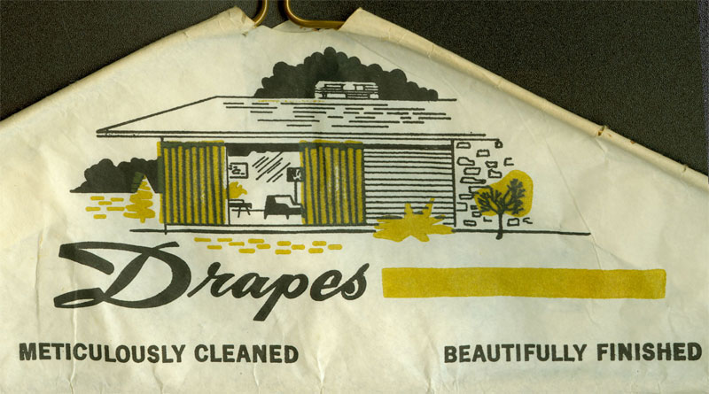
Vintage Hanger Art!

I've got two lovely examples. The first is from my hometown, Tucson, probably from the early to mid 1970s:


Click for bigger!

I love you, Judy, Don and Anne! I'm impressed they've lasted through so many moves.

This next one is generic; how could I put a date on this? This design was probably used for decades:


I have to admit the phrase "Meticulously Cleaned, Beautifully Finished" does pop into my head now and then.

Do any of you have any dated and/or amusing dry cleaner hanger art? Please send it in, and I'll post it here.

Wednesday, December 9, 2009

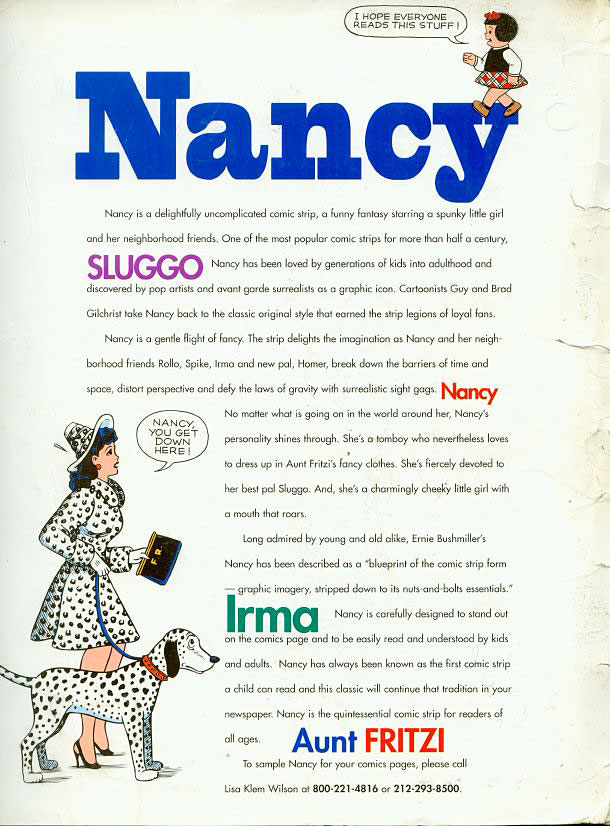
Filing Cabinet: Nancy Folder


Above is a scan of a folder sent to me by United Features Syndicate in August of 1995 to promote their re-introduction of "classic" Nancy. I disliked their concept of getting hack cartoonists-for-hire to ape Saint Ernie Bushmiller's classic Nancy and Sluggo style; it reeked of blasphemy to me because I worship them like twin gods. Here are some of the promo materials and the inside-front cover of the folder (click for a bigger view):


My two favorite parts of the above are "Introducing Homer the black smart kid" and the updated "Pee Wee the little guy," formerly known as "Pee Wee the dated oriental immigrant stereotype."


The Gilchrist Brothers never did get Nancy or Sluggo quite right: they could mimic the trees, the fences, the sacred three rocks, etc., but, well, it's kind of like when Gus Van Sant remade Hitchcock's Psycho shot-for-shot, a pointless idea when the perfectly good original is still around. Incredibly, the Gilchrists' horrible zombie Nancy is still around. Ugh. And over the years the style has warped and now it looks absolutely ghastly. Poor Ernie.

But I loved the folder, and it's still crammed with paper detritus from the mid-90s, a time when I was freelancing for magazines and working at Barnes and Noble in San Diego. Here's the inventory:

1. Oh, look, here's a TERRIBLE RACIST doodle and a business card for a gallery where I was in some group shows:


2. A print-out of a column I wrote about working at a bookstore (duh) for Your Flesh magazine. Excerpt: "Navy-Goth is actually very common, right down to the eyeliner and black overcoats. I had a Christian customer get very upset with me for carrying Anton LaVey's Satanic Bible in our store. "What kind of person buys this," he asked, no doubt imagining Pantera fans and astrology enthusiasts. Just imagine the crestfallen look on his face when I told him that it was almost exclusively members of our armed forces getting into LaVey's dull satanic tome."

3. "401(k) Savings Plan Highlights" guide from Barnes and Noble, as if what they paid me made saving possible to begin with.

4. 1997 McDonald's Monopoly game thingy.

5. Horrible letterhead from a godawful abortion of a magazine start-up I wisely bailed on. I love how the very first words ("Employee Owned") are both inept and a lie:


6. Mysterious note from Tom Tomorrow. I cannot remember what any of this means (click for bigger):


7. Letter from cartoonist Ivan Brunetti. If you've ever read his comics, you won't be surprised by the tone of this except: "Anyway, here is the first issue of my comic book, Schizo. It's very late, due to the ineptitude of myself, the United Parcel Service, and the printer. You'll note that the printer did a lousy job on the book. Oh well. I am cursed."

8. My favorite rejection letter, from The Advocate:


Sunday, December 6, 2009

Grandpa


Oh, look, it's Richard Douglas Huestis, my father's father, and it's 1924, the year before my father was born. This portrait by an unknown photographer (I colored it) was taken when my grandfather was a young executive at the Bell Telephone Company of Canada.

Be Jealous (Like Me)


I have an acquaintance who is friends with Lynda Carter. Honestly, how glamorous. And it doesn't help my jealousy issues to hear that she's warm and fabulous and smart, even though we already knew that. After all, she said, "She's the Anti Wonder Woman" about Sarah Palin. We love her.

So anyway! A few weeks ago, I accosted my friend: Ooh, I bet you're going to Wonder Woman's house for Thanksgiving, aren't you? He laughed admitted it was all true! And then he told Lynda Carter and she laughed and graciously gave him the signed copy of her new CD, shown above, to pass along to me.

How is it? Well, to be honest, it's an album of "standards," and that's not exactly my area of expertise or my cup of tea. I know, I know, revoke my gay card, etc. Ms. Carter has a strong, clear, slightly sweet voice; there's certainly no cheating or auto-tuning here; she's the real thing. I liked her version of "At Last" a lot, but her rendition of "Cry Me a River" didn't send chills up my spine like Julie London's. Her voice has a slightly "cute" quality which helps some songs and hinders others. But like I said: what do I know? I think if you are into this kind of thing, you'll love this CD. It's certainly a step way above things like Rod Stewart doing standards or celebs who think they can sing but really can't.

The point of this story is that  Lynda Carter is very talented and very nice, so nobody should ever say anything bad about her ever, the end.

Thanks, Lynda!

Tuesday, December 1, 2009

Now Here's A Protest I Can Get Behind


So true! Look: this blog is NOT about politics, and never will be (well, not blatantly, at least), but this was irresistible. The full story and hilarious full picture is here.